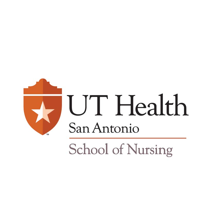
This download is a .zip file that contains both vertical and horizontal logo formats in EPS, JPG, GIF and PNG files.
The new logo for UT Health San Antonio was designed to convey the prestigious nature of our organization. It is intended to reflect the trust and high esteem that the university has earned.
Inspired by our of official seal.
The new logo is created from elements of The University of Texas Health Science Center’s official seal. Members of our school of medicine faculty advocated for the use of the shield as our symbol. Shields have long represented illustrious academic organizations. The shield shape was kept, and modernized, to communicate that we are an academic institution. The star in the center of the shield was kept, and simplified, to represent Texas pride.
Taking advantage of the great reputation of the UT System.
The new shield logo is in two tones of orange. While this is not the same Pantone Matching System (PMS) color as the UT Austin burnt orange, the colors do have a family connection. We use two tones of brighter orange to make the shield more dimensional.
Born in San Antonio.
Our impressive academic pursuits and our forward-thinking research discoveries all start here in San Antonio. With the shape of the Alamo atop our shield logo, we customize the standard academic shield to reflect our connection with our city. We are San Antonio’s only academic health center and essential to its economic engine in the bioscience industry. For patients, having San Antonio imagery conveys that we are the health resource for their city. For faculty and students, this recognizes that our world-changing medical advances have all started in this remarkable place.
Communicating Health.
While the icon part of our new logo (shown on the following page) conveys that we are an academic health center based in San Antonio, and that we are related to the UT System, the logotype reinforces that we are all about “health.” The font is Goudy, which is classic, prestigious and very legible. The word “Health” is the largest word in our new name, to communicate that health is central to our mission.


